Color Glossary
There are a lot of definitions that are important to understand when it comes to describing and discussing color. We'll break down some of the most important so the rest of the lessons in this module make sense.
Hue
Hue is a color's location on a color wheel or slider. Hue is almost a fancier word that we colloquially use for color.
You can see how any color can have a hue, but 2 blues can still have different hues:
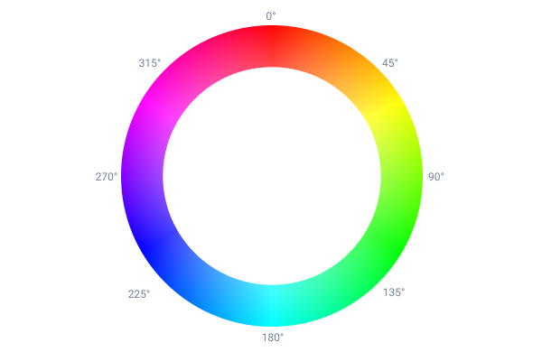
The numbers from 0-359 that make up a hue relate to degrees on a circle, this makes more sense when you see a hue as it's represented on the color wheel, instead of in a slider:

This means when you are rotating a hue (a phrase commonly used to refer to adjusting a hue), it's like you are rotating a color around the color wheel.
Saturation
Saturation is how vivid or full a color looks. It describes how vibrant it appears in relation to its hue.
0% means a color is almost entirely gray:
100% means a color is entirely vivid and full. That level of vividness is usually seem in elements that are meant to be striking like logos:
Somewhere in the middle gives it a mix of gray and its hue, these kinds of colors are quite useful in a UI as they can help you strategically emphasize something without overdoing it:
You'll notice that this makes hue and saturation related in that 2 completely different hues at 0% saturation will actually look exactly the same:
These 2 colors have different hues (which you can verify by using the slider), and they only look different at 0%, as opposed to at 100%, which differentiates this description of the color from lightness (described below).
Lightness
Lightness measures where a color falls in relation to the most light color (white) and the least light color (black).
When you dial lightness up, it makes a color completely white:
And you dial lightness down, it makes a color completely black:
You'll notice with lightness that colors look identical at both 0% and 100%, regardless of hue, which differentiates it from saturation.
Brightness
Brightness is subtly different than lightness, and some designers will prefer it (instead of lightness) as a measure of blackness/whiteness. The only difference is that a color with 0% brightness will only be white when saturation is 0. This can be visualized easily by looking at a color picker:
In both cases, rotating hue only changes values when you have a higher brightness/lightness.
Shade
If you add black to a color to darken it, you get a shade. This is equivalent to decreasing lightness or brightness.
Tint
If you add white to a color to lighten it, you get a tint. This is equivalent to increasing lightness or brightness.