Strategies for Accessibility
Accessibility in color affects all users, and is a necessity for users that have any sort of vision impediment or color blindness. The Web Content Accessibility Guidelines (abbreviated as WCAG) dictate certain requirements for on screen text to ensure it's visible. Their thresholds aid users in cases with color blindness, poorer vision, or even using a screen in sunlight.
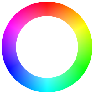
You can get an idea of what the color wheel looks like to individuals with different symptoms of color blindness in the tool below:
WCAG levels
WCAG 2 (the current spec) gives the following guidelines for small/normal text:
AAlevel: should have a contrast ratio of 4.5:1 or greaterAAAlevel: should have a contrast ratio of 7:1 or greater
This contrast ratio is calculated based on differences between the text and the background color behind it. Many browsers and design tools have features that can calculate this value for you.
WCAG also gives requirements for large text. The point where text goes from normal to large is loosely around 18px, though this is not a hard and fast rule because different fonts have different pixel densities.
For large text, like headings, the contrast requirements are a little lower:
AAshould have a constrast ratio of 3:1 or greaterAAAshould have a constrast ratio of 4.5:1 or greater
To see this visually, take a look at the following tables:
| Text | Color | Contrast | Level |
|---|---|---|---|
| Lorem ipsum | hsl(0,0%,75%) | 1.8 | Fail |
| Lorem ipsum | hsl(0,0%,45%) | 4.7 | AA |
| Lorem ipsum | hsl(0,0%,35%) | 7.0 | AAA |
| Lorem ipsum | hsl(0,0%,0%) | 21.0 | AAA |
| Text | Color | Contrast | Level |
|---|---|---|---|
| Lorem ipsum | hsl(0,0%,75%) | 1.8 | Fail |
| Lorem ipsum | hsl(0,0%,58%) | 3.0 | AA |
| Lorem ipsum | hsl(0,0%,46%) | 4.6 | AAA |
| Lorem ipsum | hsl(0,0%,0%) | 21.0 | AAA |
Headings don't have to be as dark because they are thicker and larger, and are much easier to read.
Another common component where contrast issues are often seen is in buttons and badges. Because they so often use white text on a color, it can mean a difficult time pairing accessible values together.
These examples below I pulled from real production apps.


These pieces of UI actually fail at passing the AA WCAG level. This kind of UI is often very easy to correct by using a light tint from your color scale with a darker shade for the text.
Because of the mathematical difference between one of your tints and a shade, you are almost guaranteed to find a better contrast because colors of different hues in your scale should behanve very similarly. Recalling what we looked over with perceived brightness means this won't be the case for every hue, but can serve as a better foundation to find an accessible pair of colors.
Element
Contrast
- White on a vibrant background both are perceived as bright, and won't have much contrast.
- Choosing colors that are equidistant mathematical steps apart guarantees stronger contrast.
You'll notice that the lighter tint as the background will actually draw less attention which is what makes this so great for badges. Because you may want a more vibrant color for buttons intentionally, be aware of white text paired with your base color and plan accordingly.
Element
Contrast
Element
Contrast
Some resources (like Color Review linked below) are very helpful for finding how colors pair for accessibility.
There are other tools that already take APCA into account, Huetones that was linked in the previous lesson is one of them.
In Data Visualization
When it comes to data viz, you might need to think about how you use color a little differently. Consider the colors Tableau chooses for their default data visualizations:

A company so invested in displaying data would take the time to choose good colors for the job right? You'll notice that the colors next to each other are purposefully very different, and stand out well on their own as well.
You can read more about why and how Tableau chose those colors in their own blog post on the subject:
The important note to realize with Tableau's color scheme is how they use high contrast colors, rather than analagous colors like from a single color scale.
Colors from a single scale will look visually appealing and may fit your brand easier, but users will have more difficulty discerning how tooltip colors and legends relate to different elements in a visualization. Look how much easier it becomes to distinguish different small slices on this chart once we switch away from an analagous color scale:
- Similar blues make small slices on adjacent bars hard to distinguish
- Visually distinct colors with high contrast makes slices of data clearly separate
Display intent with more than just color
Data visualizations that would use colors like these often surface trends in the positive or negative direction. It's fairly common to see a color like green associated with a positive trend, and a color like red associated with a negative one. The problem is, those two colors appear almost the same to someone that is colorblind.
When marking contrast in elements of your UI, be sure to use more than just color to convey meaning. A user with red/green color blindness will not see the positive sentiment of a button or trend line until you add something to denote meaning alongside it. Even a small decorative icon to give direction helps.
- Monthly Revenue
- $655,670
- 10.8%
- The direction of percentage trends can't be inferred from a number alone (is it an absolute value?)
- An arrow icon indicates the direction of the trend, even when color can't be seen
A great side effect of paying attention to accessibility in these cases is the resulting UI often looks even better! It pays to pay attention to your users!
- Monthly Revenue
- $655,670
- 10.8%
- Monthly Revenue
- $655,670
- 10.8%
